
Introduction
For my final project at General Assembly in the data science path, I chose to analyze customer data from the autoinsurance industry using Python and the Pandas library on Jupyter Notebook. The dataset was obtained from Kaggle here, providing valuable insights into our customer base and factors influencing claims data.
Data Loading
I began by loading the provided data into a Pandas DataFrame using the pd.read_csv function. This step is crucial to kickstart any data analysis project, as it allows us to explore and manipulate the data effectively.
import pandas as pd

# Specify the path to the CSV file
csv_file_path = 'AutoInsurance.csv'

# Load the data from the CSV file into a Pandas DataFrame
insurance_df = pd.read_csv(csv_file_path)

# Display the first few rows of the DataFrame to verify data loading
insurance_df.head()
Data Cleaning
To ensure the accuracy and reliability of our analysis, I performed data cleaning, addressing missing values and duplicate entries.
# Identify the shape (rows by columns)
insurance_df.shape

# Display basic information about the DataFrame
insurance_df.info()

# Counts the number of missing value in each column of the dataframe
null_df = pd.DataFrame(insurance_df.isnull().sum(), columns=['Count of Nulls'])
null_df.index.name = "Column"
null_df.sort_values(['Count of Nulls'], ascending=False)

# Handling missing values
# Drop rows with any missing values
insurance_df.dropna(inplace=True)

# Counts the number of missing value in each column of the dataframe
count_of_duplicates = insurance_df.duplicated().sum()
print("Count of Duplicates:", count_of_duplicates)

# Handling duplicates
# Drop duplicate rows based on all columns
insurance_df.drop_duplicates(inplace=True)

# Display information after data cleaning
insurance_df.info()

# Save the cleaned data to a new CSV file
cleaned_csv_file_path = 'cleaned_data.csv'
insurance_df.to_csv(cleaned_csv_file_path, index=False)
print("\nCleaned data saved to:", cleaned_csv_file_path)
Exploratory Data Analysis (EDA)
Understanding our current customer base
I explored various categorical variables such as education, employment status, gender, marital status, vehicle class, and vehicle size to gain insights into our customer demographics.
# Display value counts for categorical variables
categorical_columns = ['Education', 'EmploymentStatus', 'Gender', 'Marital Status', 'Vehicle Class', 'Vehicle Size']
for column in categorical_columns:
   print(f"\nValue counts for {column}:")
   print(insurance_df[column].value_counts())

import matplotlib.pyplot as plt

import seaborn as sns

def visualize_categorical_column(dataframe, column):
   # Set the style for the plots
   sns.set(style="darkgrid")
   # Create a figure
   fig, ax = plt.subplots(figsize=(8, 6))
   # Count the occurrences and arrange in descending order
   count_order = dataframe[column].value_counts().index
   sns.countplot(data=dataframe, x=column, ax=ax, order=count_order)
   ax.set_title(column)
   ax.set_xticklabels(ax.get_xticklabels(), rotation=45)  # Rotate x-axis labels for better readability
   # Show the plot
   plt.show()

# To display the plots of column of choice based on user input
categorical_columns = ['Education', 'EmploymentStatus', 'Gender', 'Marital Status', 'Vehicle Class', 'Vehicle Size']
while True:
   print("Categories available for display are {}".format(categorical_columns))
   column_choice = input("Enter the name of the column you want to visualize : ")
   if column_choice in categorical_columns:
       visualize_categorical_column(insurance_df, column_choice)
       break
   else:
       print("\033[1;31mInvalid column choice. Please choose from {}.\033[0m".format(categorical_columns))

# Display basic statistics for numeric columns
numeric_summary = insurance_df.describe()
numeric_summary
Region-wise Statistics
I analyzed the data to derive region-wise statistics, providing additional insights into the distribution of policyholders across different states.
insurance_df['State'].value_counts(dropna=False)

# Dictionary for mapping State to Regions
region_mapping = {
   'California': 'CA',
   'Oregon': 'OR',
   'Arizona': 'AZ',
   'Nevada': 'NV',
   'Washington': 'WA'
}

# Enrich the data with region information
insurance_df['Region'] = insurance_df['State'].apply(lambda x: region_mapping.get(x, x))

# Display the first few rows of the DataFrame to verify enrichment
insurance_df[['State', 'Region']].head()

# Create the count plot for the 'Region' column
insurance_df['Region'].value_counts().plot(kind='bar')
plt.title('Bar Chart of Policyholders by Region')
plt.xlabel('Region')
plt.ylabel('Count')
plt.tight_layout()
plt.show()
region_stats = insurance_df.groupby('Region').agg({
   'Customer Lifetime Value': 'mean',
   'Monthly Premium Auto': 'mean',
   'Total Claim Amount': 'sum'
}).reset_index()

# Convert the 'Total Claim Amount' column to whole numbers
region_stats['Total Claim Amount'] = region_stats['Total Claim Amount'].astype(int)

print("\nRegion-wise Statistics:")
print(region_stats)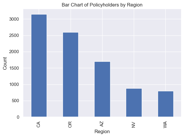
Claims Analysis
I performed an analysis of claims data, categorizing total claim amounts into low, medium, and high groups.
# Display basic statistics for Total Claim Amount
insurance_df['Total Claim Amount'].describe()

# To group the Total Claim Amount by Low, Medium and High and using basic debugging try/except
insurance_df['Claims_grp'] = ''
for i in range(len(insurance_df)):
   try:
       if insurance_df['Total Claim Amount'][i] <= 383:
           insurance_df['Claims_grp'][i] = 'Low'
       elif 383 < insurance_df['Total Claim Amount'][i] < 964:
           insurance_df['Claims_grp'][i] = 'Medium'
       else:
           insurance_df['Claims_grp'][i] = 'High'
   except KeyError:
       print(f"Error: 'Total Claim Amount' column not found in row {i}.")

# Verify the result
print(insurance_df[['Total Claim Amount', 'Claims_grp']])
insurance_df['Claims_grp'].value_counts()

# To group the Total Claim Amount by Low, Medium and High and resetting the index
insurance_df.reset_index(inplace=True)
insurance_df['Claims_grp']= ''
for i in range(len(insurance_df)):
   if insurance_df['Total Claim Amount'][i] <= 383:
       insurance_df['Claims_grp'][i]= 'Low'
   elif (insurance_df['Total Claim Amount'][i] > 383) and (insurance_df['Total Claim Amount'][i] < 964):
       insurance_df['Claims_grp'][i]='Medium'
   else:
       insurance_df['Claims_grp'][i]='High'
insurance_df['Claims_grp'].value_counts()
insurance_df.head()

# Assuming 'insurance_df' is your DataFrame
claims_group_counts = insurance_df['Claims_grp'].value_counts()

# Create a smaller pie chart
plt.figure(figsize=(6, 6))  # Adjust the figsize as needed
plt.pie(claims_group_counts, labels=claims_group_counts.index, autopct='%1.1f%%', startangle=140, colors=plt.cm.Set3.colors)
plt.title('Claims Group Distribution')
plt.axis('equal')  # Equal aspect ratio ensures that pie is drawn as a circle.

# Show the pie chart
plt.show()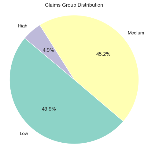
49.9% of the Claims Amount is considered low, followed by 45.2% is medium and 4.9% is high.
Histogram of Total Claim Amount
To understand the distribution of total claim amounts, I created a histogram.
# Basic statistics for Total Claim Amount
insurance_df['Total Claim Amount'].describe()

# Create a histogram
plt.figure(figsize=(10, 6))
plt.hist(insurance_df['Total Claim Amount'], bins=20, edgecolor='black')
plt.title('Histogram of Total Claim Amount')
plt.xlabel('Total Claim Amount')
plt.ylabel('Count')
plt.tight_layout()
plt.show()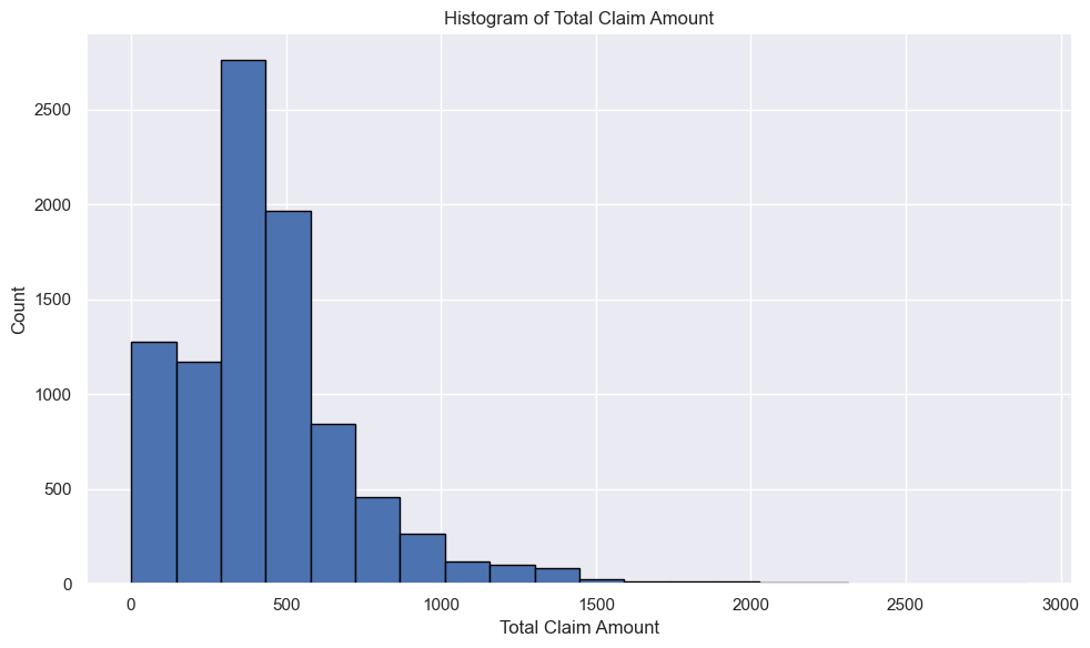
This shows positively skewed distribution as its tail is more pronounced on the right side. That means, most of the values end up being left of the mean. This also means that the most extreme values are on the right side.
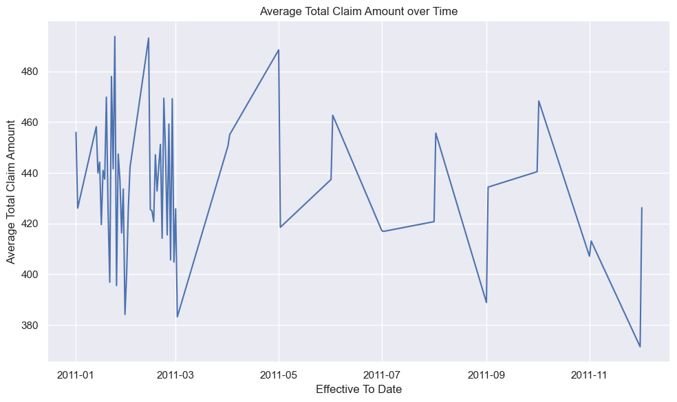
Line Chart: Effective To Date vs Total Claim Amount
Analyzing the cumulative sum and average of total claim amounts over time provided additional insights.
# Convert 'Effective To Date' to datetime
insurance_df['Effective To Date'] = pd.to_datetime(insurance_df['Effective To Date'])

# Group the data by 'Effective To Date' and calculate the sum of 'Total Claim Amount'
date_claim_sum = insurance_df.groupby('Effective To Date')['Total Claim Amount'].sum()

# Create a line chart
plt.figure(figsize=(10, 6))
plt.plot(date_claim_sum.index, date_claim_sum.values.cumsum())
plt.title('Cumulative Sum of Total Claim Amount over Time')
plt.xlabel('Effective To Date')
plt.ylabel('Cumulative Sum of Total Claim Amount')
plt.tight_layout()
plt.show()

# Group the data by 'Effective To Date' and calculate the average of 'Total Claim Amount'
date_claim_avg = insurance_df.groupby('Effective To Date')['Total Claim Amount'].mean()

# Create a line chart
plt.figure(figsize=(10, 6))
plt.plot(date_claim_avg.index, date_claim_avg.values)
plt.title('Average Total Claim Amount over Time')
plt.xlabel('Effective To Date')
plt.ylabel('Average Total Claim Amount')
plt.tight_layout()
plt.show()
Relationship Analysis
To understand the relationship between claims amount and other numerical variables, I created a scatter matrix and a correlation heatmap.
# Select the numerical columns you want to include in the scatter matrix
numerical_columns = ['Customer Lifetime Value', 'Monthly Premium Auto', 'Total Claim Amount']

# Create a scatter matrix
scatter_matrix = pd.plotting.scatter_matrix(insurance_df[numerical_columns], figsize=(10, 10), diagonal='hist')
plt.suptitle('Scatter Matrix of Numerical Variables')
plt.tight_layout()
plt.show()

# Select the numerical columns you want to include in the heatmap
numerical_columns = ['Customer Lifetime Value', 'Monthly Premium Auto', 'Total Claim Amount']

# Calculate the correlation matrix
correlation_matrix = insurance_df[numerical_columns].corr()

# Create a heatmap
plt.figure(figsize=(8, 6))
sns.heatmap(correlation_matrix, annot=True, cmap='coolwarm', center=0)
plt.title('Correlation Heatmap of Numerical Variables')
plt.tight_layout()
plt.show()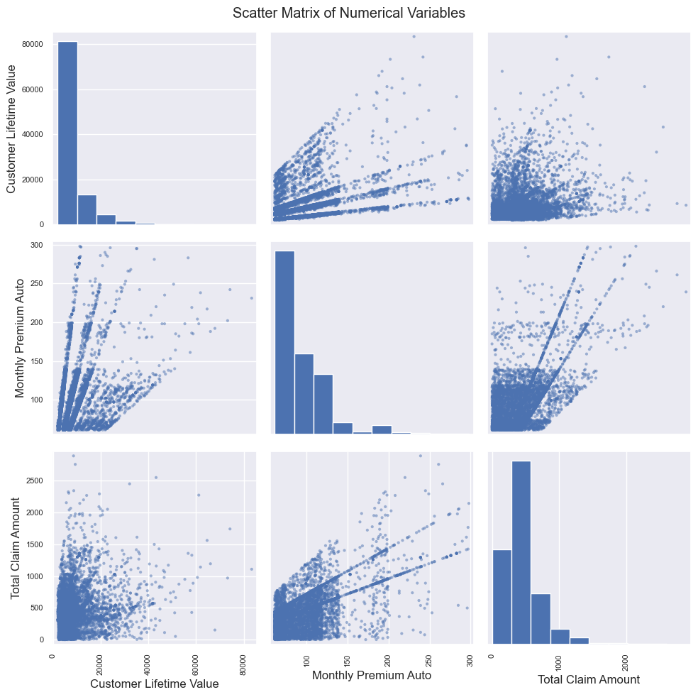

A correlation coefficient of 0.63 indicates a strong positive relationship between Monthly Premium Auto and Total Claim Amount. This also suggests that when the Monthly Premium Auto increases, the Total Claim Amount tends to increase significantly.
Conclusion
This Python project, focused on customer autoinsurance analysis, provided valuable insights into our customer base and factors influencing claims data. The combination of data loading, cleaning, and exploratory data analysis techniques from the General Assembly bootcamp has revealed patterns, trends, and relationships that can be utilized for informed decision-making in the autoinsurance industry.


